toolpanels in action
To see toolpanels 'in the wild,' just head over to the examples page for examples of the various types of things that the controls can be made to do. The following screenshots are of what to expect while developing with ToolPanel Controls (mostly in Visual Studio.NET).
toolpanel toolbar
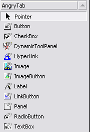
Because VS.NET and ASP.NET Matrix allow for 3rd party controls to be added to the designer toolbar, ToolPanel comes with its own set of icons that will be installed for you to help you distinguish them from their 'normal' counterparts. (AngryPets highly recommends that you put them into their own/custom tab -- just to avoid confusing them with intrinsic ASP.NET Controls.) Below is a screenshot of the controls available in the ToolPanel Suite:

designer / configuration
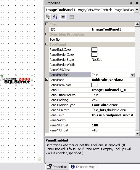
ToolPanel Controls provide designer support for VS.NET and for ASP.NET Matrix. (They also work fine with Dreamweaver and other 'designer' compliant tools). As you can see, there's nothing special about they way they appear in the designer (The goodness all comes from ASP.NET -- ToolPanel Controls just exploit the baked-in goodness). The properties pane makes it a quick snap to add professional 'pop-ups' to your pages/controls.

As ASP.NET WebControls they are also configurable via markup, or programatically during runtime as indicated by the two screenshots below.

Runtime sample screenshot:

To see more screenshots and to get a better idea of how everything works, check out the tutorial for mor information.


